Returning to the Folkestone School for Girls Hub:
FSGhub.blogspot.com
Link to our group blog:
hollysmithsophiewest.blogspot.com
Friday 8 April 2011
Tuesday 5 April 2011
4) How did you use media technologies in the construction and research, planning and evaluation stages?
Research and planning


The written storyboard also gave us guidelines of where actors needed to be, when, and how long for. During this, the drafts of the print production texts in the planning stage gained verbal feedback, producing more professional texts.
Then we began the filming:


For the research and planning stages we used a blog.

We created one blog for the whole group, and each updated it every time we made a contribution to the project; for example I constructed the reader profile so uploaded this onto the blog. The blog was used for the research and planning for all three texts, but we could not upload the construction of trailer as we did not have the software so only showed the planning stages, for example, the storyboard. We could add our own opinions and other internet users could follow or look at the work we were doing. They could also comment by sharing their views on different stages of the research and planning helping us with the construction because they could be in our target audience, and any feedback is helpful. The internet was also used to get research on who reads TV listings magazines where we found it was generally middle aged mothers. This helped us decide to target our magazine at them as well as have our target audience for the trailer for 18-24 because it entices a variety of audiences.
Construction
Having completed our research and planning and organising our actors, we used the storyboard as a plan for our filming. Therefore, we could be more organised in what we were filming when and the shot types and angles being used.


The written storyboard also gave us guidelines of where actors needed to be, when, and how long for. During this, the drafts of the print production texts in the planning stage gained verbal feedback, producing more professional texts.
Then we began the filming:
To do the filming we used a video camera which was the same one for all filming to keep the picture the same once it was uploaded onto our computer software.

The computer editing software we used was Final Cut Pro.
Instead of one clip jumping to the next we used transitions to make the trailer flow and to imply it is changing to a different storyline. To emphasise the storylines and give the trailer meaning, we included text before slides every time there was a new event. At the beginning of the trailer we included text to emphasise to our audience that it is a new soap:

The text prevented confusion by the reader who may have been unsure what the clip meant without the text as from our questionnaire feedback we realised that some people did not read the moving image as we expected. An example of this is the pregnancy scene.

Most people said this scene was not completely clear as to what was happening, so the text, ‘new life’ before the clip brings to light what the storyline is. However, this scene could have been made absolutely clear with a supporting film clip of a letter from the NHS stating that the character was pregnant.
The storyboard strip in which we inserted all the clips into helped us to actually see the moving image coming together.

When we first inserted the clips they were far too long for the trailer so we cut them down are reordered them. We could also delete any clips we disliked or was not needed in the storyboard. We inserted the music into the storyboard underneath the image where we could compare the lengths of both the moving image and the sound to get them to the same length. The additional music ‘Skateboarding’ had a fast pace to set the mood. We created this on 'Soundtrack Pro':

In this programme we could insert any sound effects into our music and alter the volume and several other settings, for example if we wanted it to echo. However, my group and I kept the sound track as it was as we found in our research that teens would be more attracted to a trailer with a fast pace and adding sound effects would make the soundtrack less effective. We also found that teens are interested in sharp, quick clips. Therefore, we made the clips as short as possible in order for the snappy music to work well with then jumpy moving image.
A different camera was used to take still images for the TV listings magazine and the poster. which were constructed on Microsoft Publisher.

The programme is contains simple editing software which allowed us to add text to the post and create it in landscape form.
Group evaluation

The blog we constructed at the beginning of the project was useful for feedback once the production was complete. Our audiences opinions would informed us what was good and bad about the two print productions which helped us decided what we would change if we were to do the project again. We found that the main change we would make to the TV listings magazine was to change the ‘bully’s’ look to suit their character; for example, remove the plaits and have her hair scraped back and put in a high bun with a silver chain round her neck. We have also uploaded the trailer on to 'YouTube' to gain further feedback it is not possible to add it on to the blog.
3) What have you learned from your audience feedback?
My group and I have achieved the engagement of the target audience as every volunteer, apart from one, who filled out the questionnaire said they would watch the soap. The questionnaire was filled out by several different age groups so this means not only have we attracted the interest of our target audience but other audiences too. The one volunteer who said they would not watch the soap was male, therefore, this means that our soap would maybe attract more male attention than female.

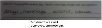


Volunteers have all identified at least three of the five themes/life events in the trailer which means the narratives have been conveyed well and people can understand the meaning of the text. This has been supported by the text before the clips explaining the narrative.

However, one of the life events; pregnancy, was not presented as well. This is because several volunteers wrote on the questionnaire that they were unsure what was going on in that part of the trailer and it was not identified by many. During the planning and filming stage we were unaware of this problem because we knew what the narratives were so could not see that it was unclear. This implies that not everyone reads the text as you would expect them to. To make all narratives clear the clip with the character sitting on the floor should be made more apparent that she is looking at a pregnancy test with maybe a zoomed in shot of the actual pregnancy stick.

All volunteers identified the stock characters and created a relationship with these. This is an achievement because we wanted to gain this from the trailer as it would engage the audience and want them to watch it. Most said that the ending of the trailer, with the protagonist laying on the floor unconscious, created a relationship between the viewer and the character with an element of sympathy. This enticed the audience to want to know what happens next, becoming eager to see the soap.

Each person that filled out the questionnaire said that the pace of the trailer suited the themes because the themes included drugs and alcohol which are both hard hitting and frightening. Frightening things usually happen quickly and are out of the individual’s control, therefore, the short clips and different camera angles created more of an experience and made the audience feel more involved in the themes. Also, the music made an impact with its fast beat, creating a faster moving atmosphere.

Finally, the peer evaluations when the text was at a draft stage helped to notice any areas for development. The peer evaluation alerted us to the idea that we needed to include text before the clips to make the narratives more clear. This has improved our overall achievement of the trailer as the audience understood what was going on and what the soap was about which was our aim.

2) How effective is the combination of your main production and ancillary texts?
The texts combined create a promotional package as between them they provide the three aspects which interest the audience. The magazine is the informational text as it includes an interview to reveal more about one of the stock characters to the audience. The poster is a teaser to the audience because they could see it during travelling on the bus for example and read the tag line; pushing them to want to know more. Also, they could see the image and wonder what has happened to her but the poster gives no further information. Therefore, they would be looking out for the trailer. The trailer causes drama as it reveals to the audience short snippets of the upcoming storylines in the new soap in which the audience would be draw in to. The audience can create a relationship with the stock characters meaning there is more emotion and the audience would feel more involved.


The texts work together due to links between them. An example of this is recurring images; the image of the protagonist laying on the floor hurt is on the poster as well as in the trailer. Therefore, if the audience has already seen one of the advertisement texts, they would remember which soap it is if they were to see the other text. Another link is an image of the protagonist on the TV listings magazine. It is a different image and is not from the trailer, but is still the same character meaning a link can be made. If the same image was used it may become tedious, so there needs to be some variety.
Other than the slight discontinuity in the brightness of the colours on the magazine and the poster, there is a sense of continuous house style throughout the texts. The use of black and white is used in all texts; the TV listings magazine in the masthead, the text on the poster and the text and background on the trailer. Continuity is used to familiarise the audience with the soap and this is typically used in real media texts. Our three texts all contain common features which real media texts include to also create a house style.

1) In what ways does you media project use, develop or challenge forms and conventions of real media products?
Print production:
TV Listings magazine
In the TV listing magazine several conventions have been followed. The mast head is located in the top left hand corner in which I have noticed on several other magazines:


TV Listings magazine
In the TV listing magazine several conventions have been followed. The mast head is located in the top left hand corner in which I have noticed on several other magazines:

It is located here because it is normally the first place the audience look on the page. Also, when on a shelf in a shop only the top of the magazine shows, so the masthead will always be on show for the public to quickly identify it. This would generate more advertisement as a larger audience would notice the magazine and its name.
Another convention we have met is including a price puff on the front. The use of a bright puff helps it to stand out so the audience can quickly discover how much it is if they are in a hurry.

The image above represents the common use of a price puff and how conventional it is in professional TV listings magazines. The puff emphasises it is of a low price as it is lower than a pound which influences the audience to purchase it.
Two other conventions we have followed to make the magazine look more professional are including a tag line and the days of the week down the side of the page.

The tag line advertises the magazine and the catchy on-liner entices the audience to read more. The weekdays provide evidence that there in information on soaps for everyday of the week, letting the audiences learn more.
However, my group and I have decided to challenge the convention of including various other soap opera gossip in the TV listings magazine because we want it to be focused on our new soap and for the audience not to get distracted by others. If others were included we would be advertising soaps that we are competing against so we want our audience to only read about ours.

On the other hand we introduce a separate audience into our magazine unlike real media texts. The magazine is aimed at working class women but we have included an interview with one of the actresses from our soap for a younger generation.

We have done this to widen the variety of audiences and welcome different ages to the magazine. Even though it has gone against conventions of real media texts we believe that if women have it in the house they are likely to have teenagers who will see it. Therefore, it would attract another audience.
Another convention we subverted, was having both characters making eye contact.

The example of real media texts show all actors making eye contact, which is usual on most TV listings front covers. However, we decided to have the bully character not making eye contact because we were trying to create an idea of power. The actress making eye contact is not smiling so is giving the impression she is unhappy with the other looking at her target of ridicule in which she has control and power. We were trying to give the idea that the vulnerable character is looking out to the audience for help, therefore the audience creates sympathy for her.This supports their roles in the trailer as we were aiming to gain empathy from the audience towards the vulnerable character.
Poster
Comparing our poster to an example of a real media text of a soap opera ‘Neighbours’ there is still a contrast in the use of eye contact.

We did not include eye contact because we wanted to emphasise that she is hurt and is experiencing a life of turmoil. Whereas, the example shows happiness with eye contact, welcoming the audience into their soap. The image on our poster creates sympathy towards the character because the audience need to know what has happened to her and whether she survives.
The horizontal page orientation could be conventional or unconventional as research has shown that a variety is used.

The posters could be used horizontally on billboards or vertically on bus stops. The reason for the choice of a horizontal page orientation is to match the image because if the page was vertical the actress would look like she is leaning against a wall. Therefore, this angle depicts a better meaning and shows the disorientation of the character.
My group an I have followed the convention to real media texts and just using one main image. However, in contrast to the neighbours' advertisement poster including several different characters, we used an image with just the main protagonist. The reason for this is to exaggerate the dramatic storyline so the public want to know what has happened to her and why she is laying on the floor. The focus of the main protagonist advertises the soap well because the trailer largely involves her even though others are included too.
Finally, the use of the soap opera name being situated at the bottom of the page could be conventional or unconventional. This is because it is assumed that the title would go at the top of the page, but at the bottom there is the idea of recency and the audience would remember the name as it is the last thing they look at. This is also shown on the real media text of the advertisement for neighbours.
Moving image:
My group and I have attached background music to the moving image. This is conventional in trailers because it help set the mood and create atmosphere, for example in a horror trailer, eerie music would be used.To edit the soundtrack and save it we used the programme 'Sound Track Pro'. We used the song 'Skateboarding':

We used this track because it has a fast pace which supports a fast moving trailer image. We realised it is conventional to use fast paced music during our research of watching other teen trailers. An example of one of the trailers we watched was 'E21', http://www.youtube.com/watch?v=-3XoDvLuM2Y. This shows the short clips all put together to produce a fast paced trailer with supporting music.
Another convention my group and I have followed is to include several rights of passage.

A popular teen soap 'Hollyoaks' show similar rights of passage to our trailer. Therefore, because Hollyoaks is so popular with the teens, these are what they would be looking for in a soap, and this is the reason why we have included such events.
Our soap opera trailer focuses on one main story line with a few others included but not emphasised as much as the troubled teen with problems at home.

This neither challenges or follows the forms and conventions of real teen soap trailers because there are a variety. As the E20 trailer and some of the Holloaks trailers focus on just one storyline whereas other Hollyoaks' trailers involve several storylines. We chose to include others as well as one main one to show more of a variety in rights of passage and to attract a large audience. As if there was just the one main storyline and not all of our target audiences were attracted to it or could relate themselves to it, they may see others which they enjoy.
The order of the clips of the different storylines needed to be considered. It is conventional to
Another convention we have followed is inserting text before new storyline to emphasise them.

The short one-liners help to exaggerate they storyline and explain what it is about without giving too much away. A couple of our storylines were not clear so we used this to support them. We also, found this convention quite effective as it involves a variety so it is not just moving image but text as well, and sometimes words can have more of an impact. Something else which is evident from the image above is following the convention of including the channel logo in the bottom of the screen. This is included primarily so the audience remember which channel it is on as if it was only shown at the end it may not stick in their mind as well as constantly looking ta it for about 3 minutes. Therefore, we thought it was an effective and appropriate way of reminding people.
All trailers include editing, however some are kept completely realistic so it just jumps from one clip to the next. Others, on the other hand include transitions, change of speed and change of colour. We have included change of speed and some transitions in our soap.

We decided to include these because it makes the trailer more interesting to watch as there is a variety of edits. An example of when we used transitions was when there were two clips of different storylines next to each other, and we wanted to make it clear that there was a change in event. Also, the change in speed helps to emphasise clips as some soap trailers use slow-motion in events which are sad to create the sympathy. Speeding a clip up can be used in situations which are fast paced, for example an explosion because people do not have time to think about it, it just happens. Coronation Street has a clip which is sped up to emphasise the impact of a tram coming off of its rails and it being out of the residents' control.
Finally, we have included dialogue with in not subverting or following the conventions as some soap trailers contain it and some do not. We used it to aid the understanding of the clips and to give meaning to the actions taking place in the trailer.
Friday 25 March 2011
A2 Evaluation introduction
I am writing an evalutaion for the A2 coursework (Westbourne Way) consisting of a soap opera trailer, a TV listings magazine and an advertisment poster. I created the texts and moving image with the rest of my group, but this evaluation is personal to me and is my own reflection of the project. Here I will comment on the success of the project and whether we, as a group, have a achieved what we wanted to in our trailer.
Subscribe to:
Posts (Atom)